Thanks for stopping by.
Potential.ly
I’m Farha, AN UI/UX Designer
Why I’m what you’re looking for
I’m a London based senior designer. With a aim to have happy users and clients! I have experience in UI, UX, digital and print. I have a First Class Hons in Multimedia Technology and Design BSc.
I have 14 years industry experience. Predominantly working within the children’s, parents and gaming sectors e.g. The Walt Disney Company, Hasbro & Mediatonic. I have a big passion in aiding children’s learning and a ton of experience designing and building complex systems so I hope my skills to marry well for this position.
I’d love to be considered to aiding a talented team. I am a savvy researcher & user of of children’s educational sites such as Oxford Reading Owl, Twinkl, Reading Egg as I’ve always been active in my children’s learning so I’d love to be part of a team empowering learning of young minds. I also volunteer at my childrens school to read with kids.
Password for protected contents on this page: takeapeak

Farha is one of the hardest working designers I’ve ever met. She is so committed to the user, the client, and her employer. It is inspiring! Farha brings a combination of creativity and logic, allowing her to create beautiful designs whilst keeping the user’s needs at the forefront of her mind.
I thoroughly enjoy working with Farha as she is motivating, always has great suggestions and is a truly genuine person. You can always rely on Farha to deliver. She has never let me (or our team) down! It is an absolute pleasure to work with Farha. I am so grateful to call her a friend and as well as a colleague.
— Rosie Monro – Freelance Designer
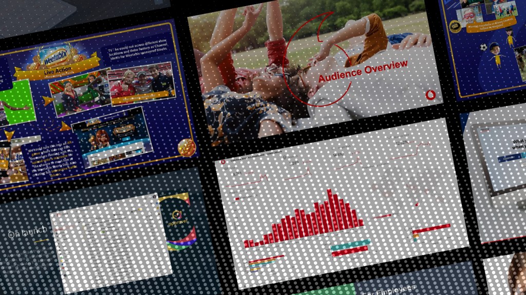
“An incredible website. Engaging. Clean and fun. Disruptive. Vodafone. Journeys – lots of journeys – and content. And how it’s presented, brought together. Seamless. BEAUTIFUL. A masterclass.”
“Together Corporate Affairs & Dauntless have reinvented Vodafone.com and have delivered a best in class solution at speed.”
– Sam Billett
Senior Communications Manager, Corporate Affairs, Vodafone

A sample OF WORK
Below are a few projects I have taken on designing from both a UX and UI point of view.
Nesco
Digital transformation of NESCO – Specialty Rentals. Design of a new marketing and sales website.
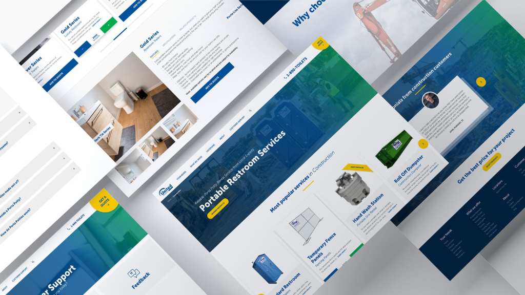
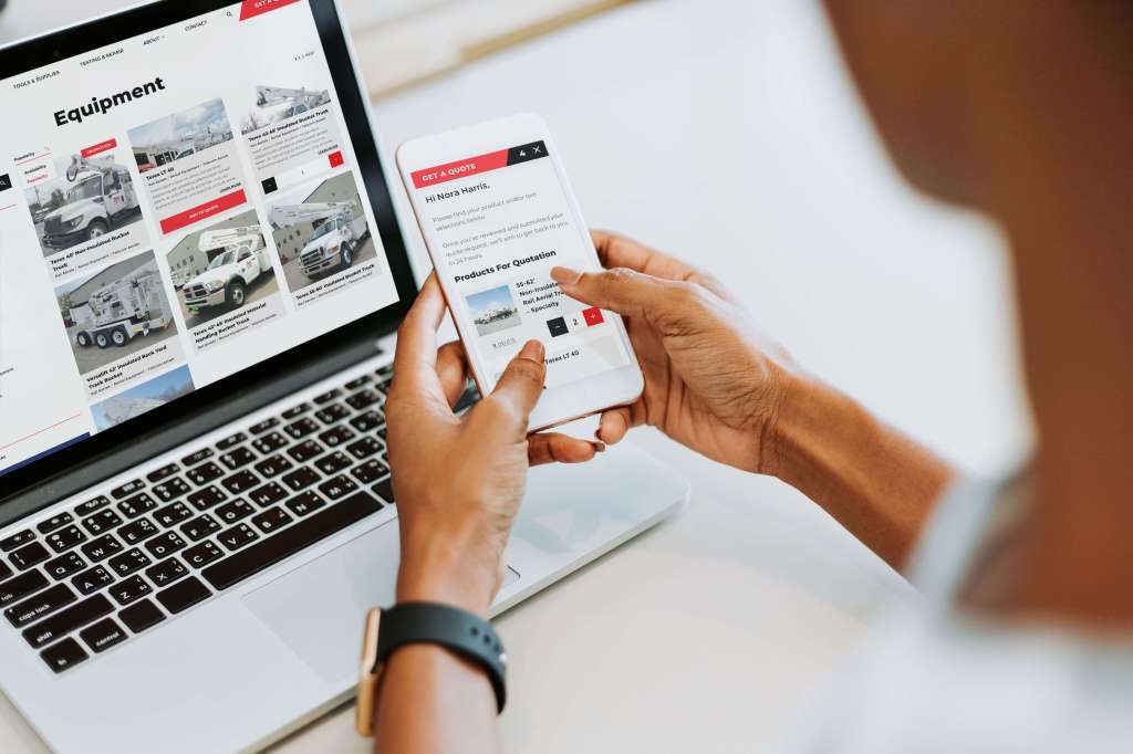
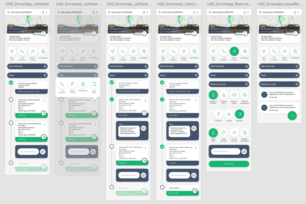
USS
USS – a plateauing business with outdated manual infrastructure was transformed to thrive through a digital transformation. I led the UX/UI design of a customer portal, employee portal, a driver applications and a sales & marketing website.
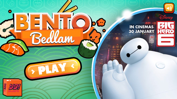
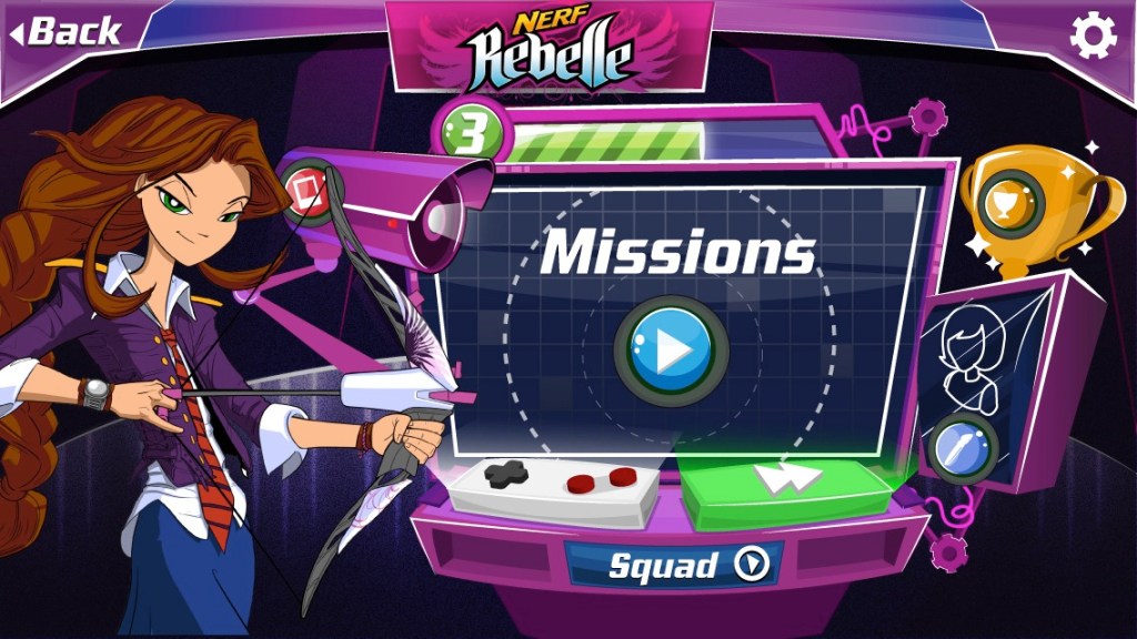
A few gaming projects
With learning I feel strongly gaming techniques and mechanics go hand in hand in aiding the processional steps in an individuals learning. Below are just a few UI screens to demonstrate some of my former gaming experiences.

Creating mockups
High-fidelity mockups are exciting because they imitate the appearance and experience of an app or website before it is actually built. These mockups include all the design elements such as branding, text, colors, logos, fonts, and graphics that will be used in the final product.
Below is a working example of a driver app for USS.
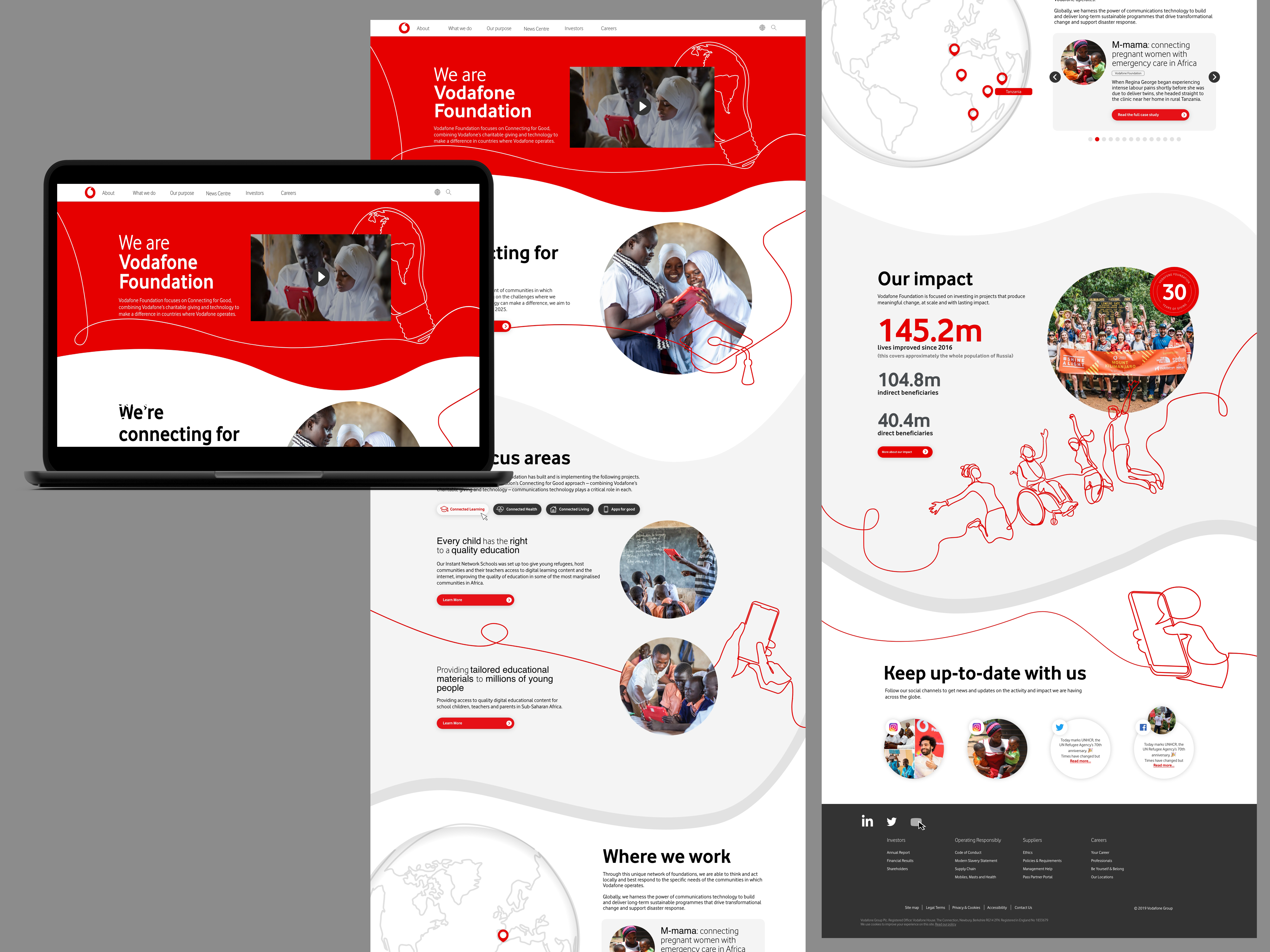
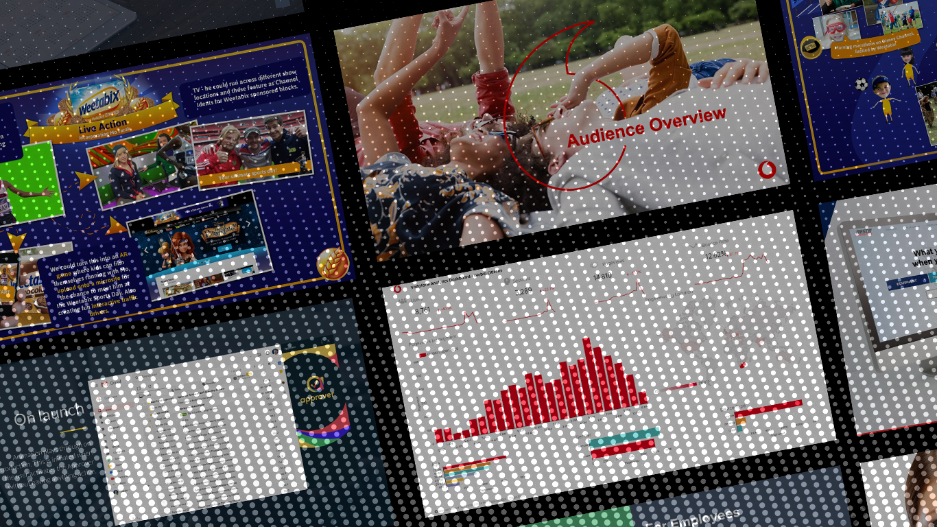
Below are some visuals for Vodafone Foundation.
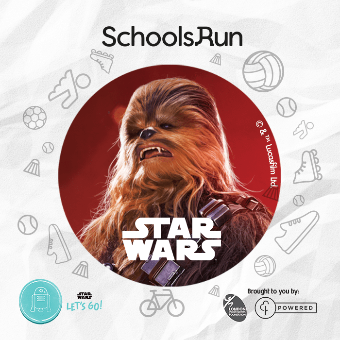
Disney Schools Run
Getting children running. In partnership with ParkRun and London Youth Games
This isn’t quite a digital product but here is a working example of using gamification techniques to influence engagement.
Techniques included:
- Milestones
- Rewards
- Social influences
- Personal Trackers
- Accomplishments i.e Points
User testing
I have experience running a wide range of user testing over the years.
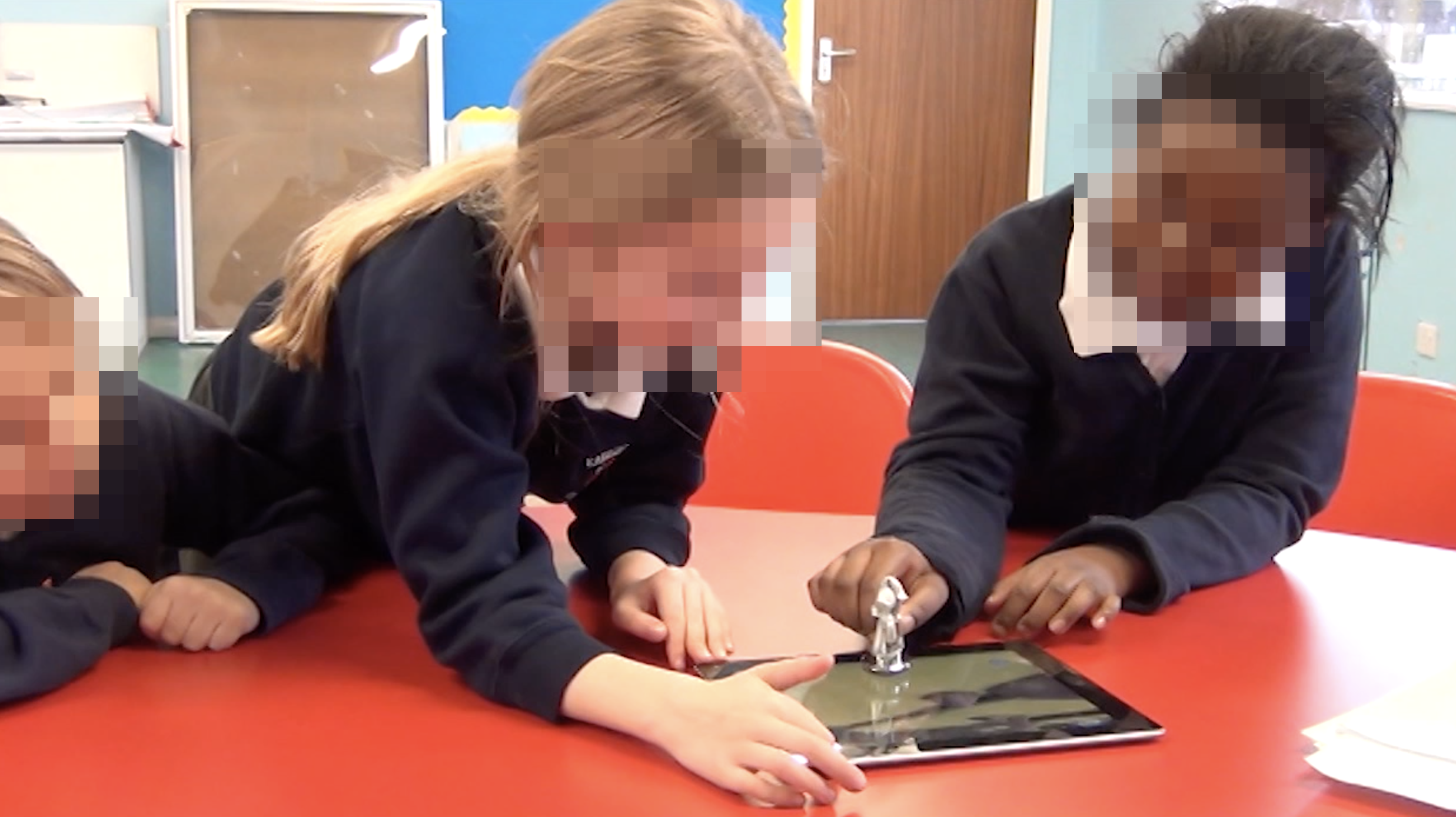
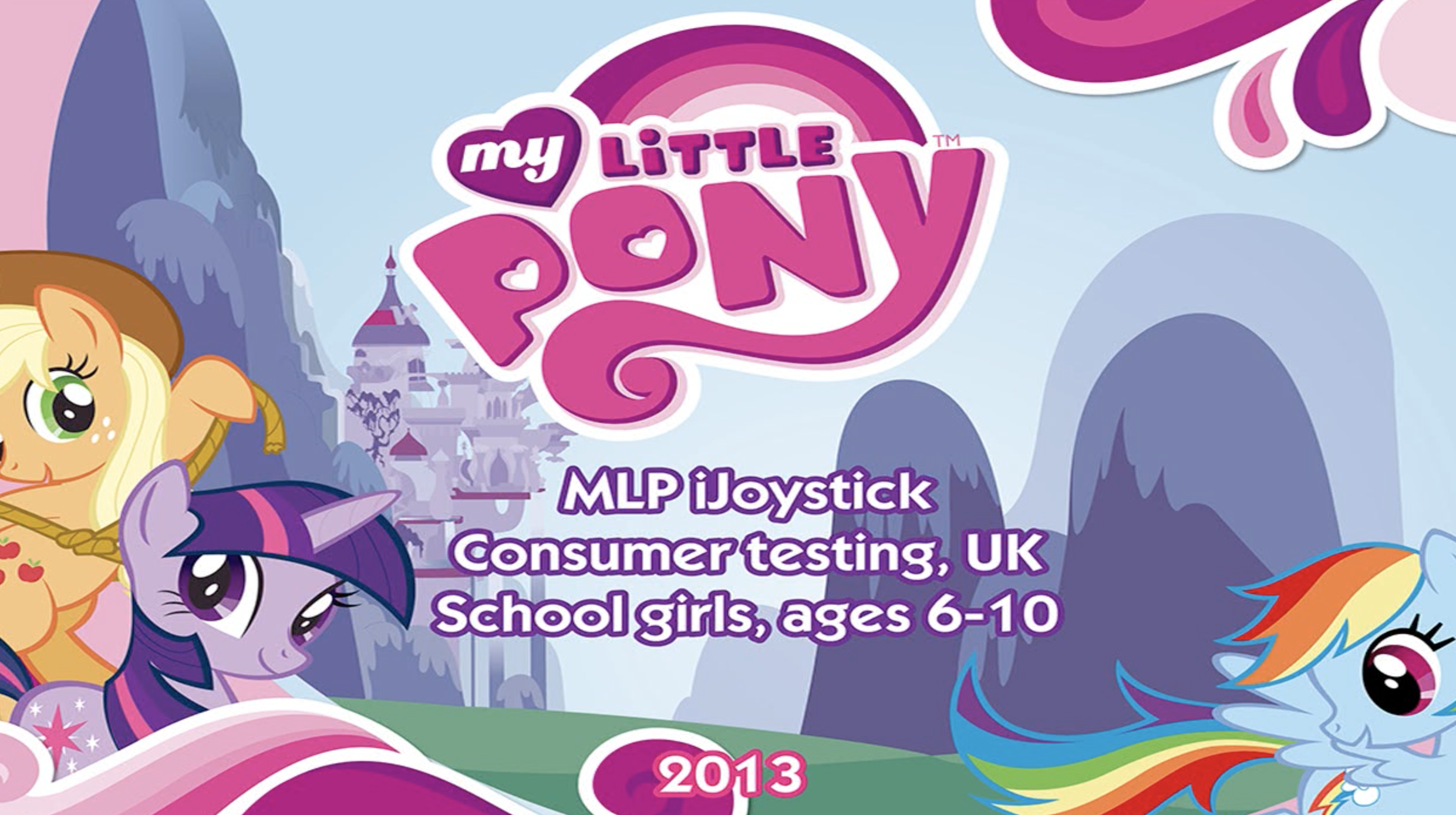
Below is an example of my time at Hasbro where we visited a school to run an in-person user testing of a prototype that I had designed and created the UI of.
I have experience setting up sites for heat map reviews and analysing the data to uncover users needs.
As well as creating user interview questionnaires.
I have conducted card sorting with internal teams to understand the hierarchy of information.

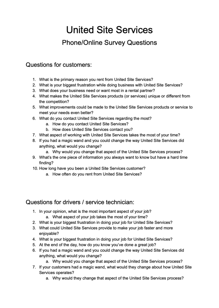
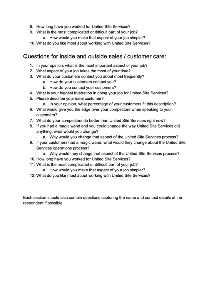
Below are set of questions to understand the users at USS that I compiled.
making things simpler
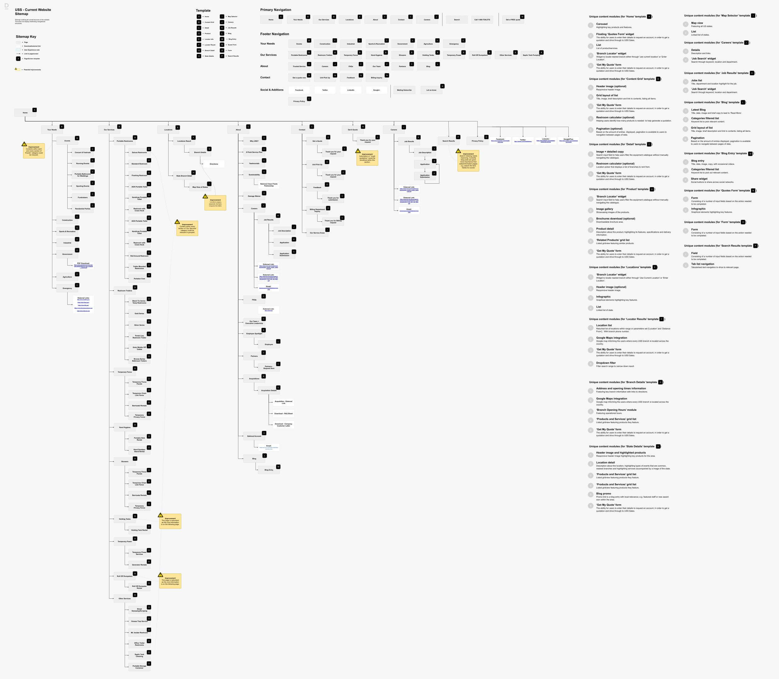
Below is an example of the scale of a former site for USS which had over 100 pages with little differentiation and lack of consistent templates making it difficult for users to navigate around the site.
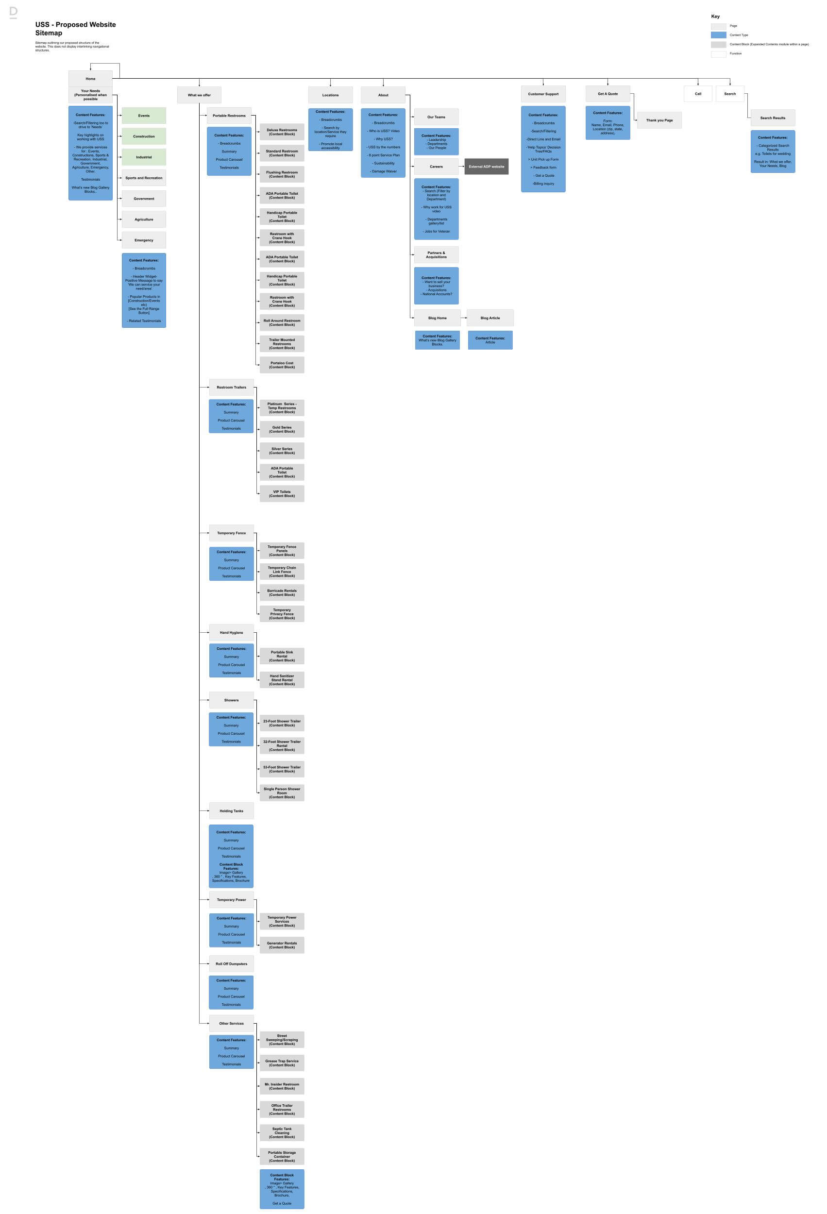
Below is my simplified solution and compression information into categories and structuring contents effectively.
Happy to work in:
Figma, XD, Zeplin, Full Adobe Suite
