Project
Design, develop and deploy a job finder platform, into the existing WordPress CMS marketing site. Populated with available openings, via a purpose-built API structure from the existing BlueLine Rental presence.
Role
Lead UX/UI designer while working at Dauntless
Date
2017
Introduction
BlueLine Rental (BLR)— once ranked #4 in North America for construction equipment rental — was falling significantly behind its competitors. To survive and thrive in the digital world, BlueLine needed to get up-to-date.
I joined Dauntless shortly after they launched & rebranded a new website and customer application for BlueLine Rental. As well as working on several marketing pieces for BLR. I came in for the relaunch of the Careers area of the site.
Problem
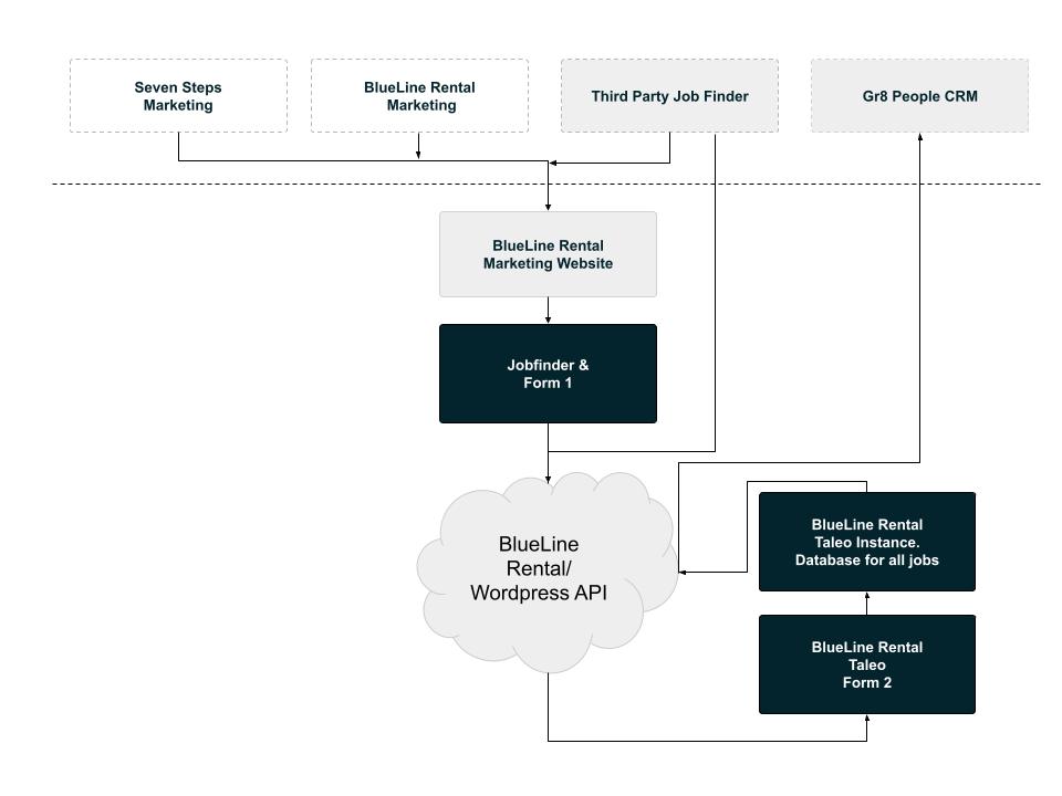
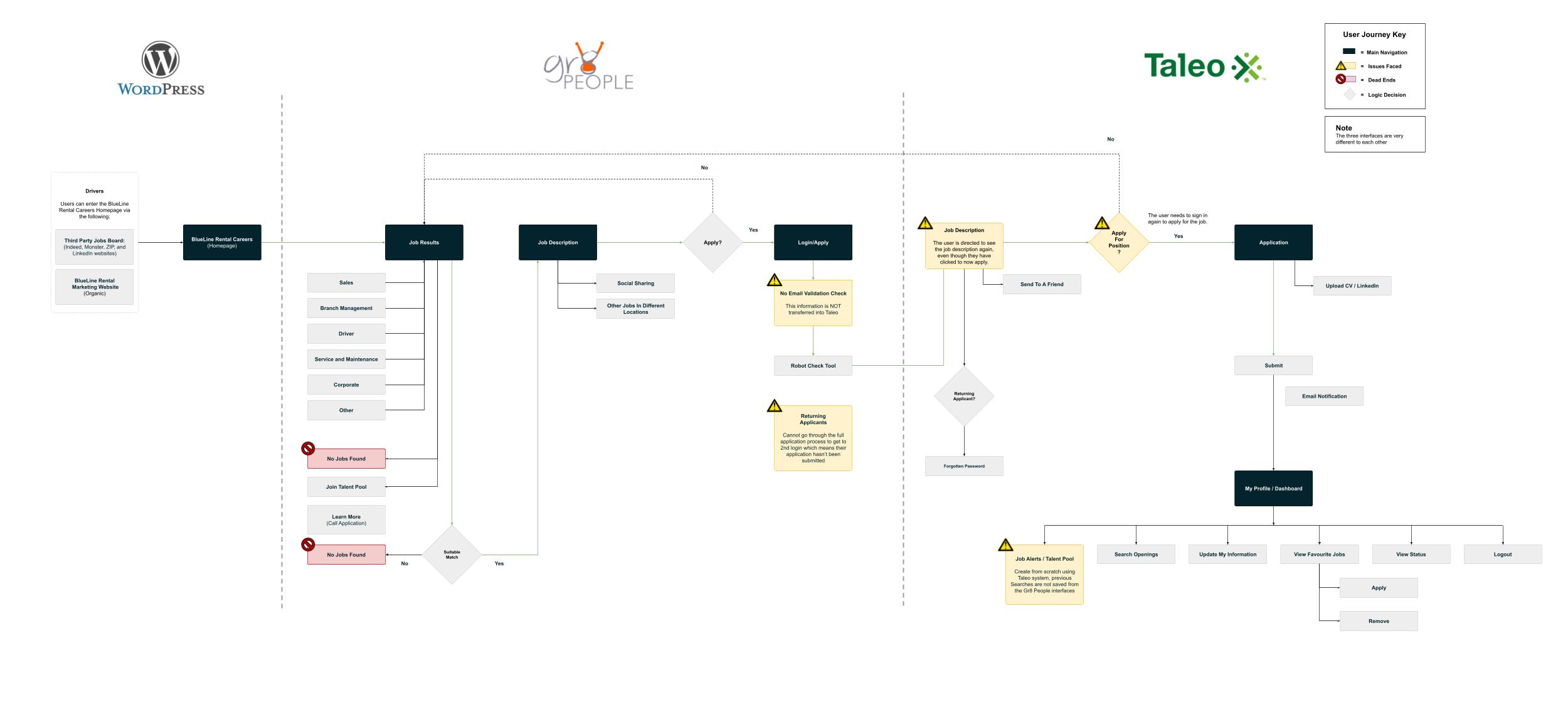
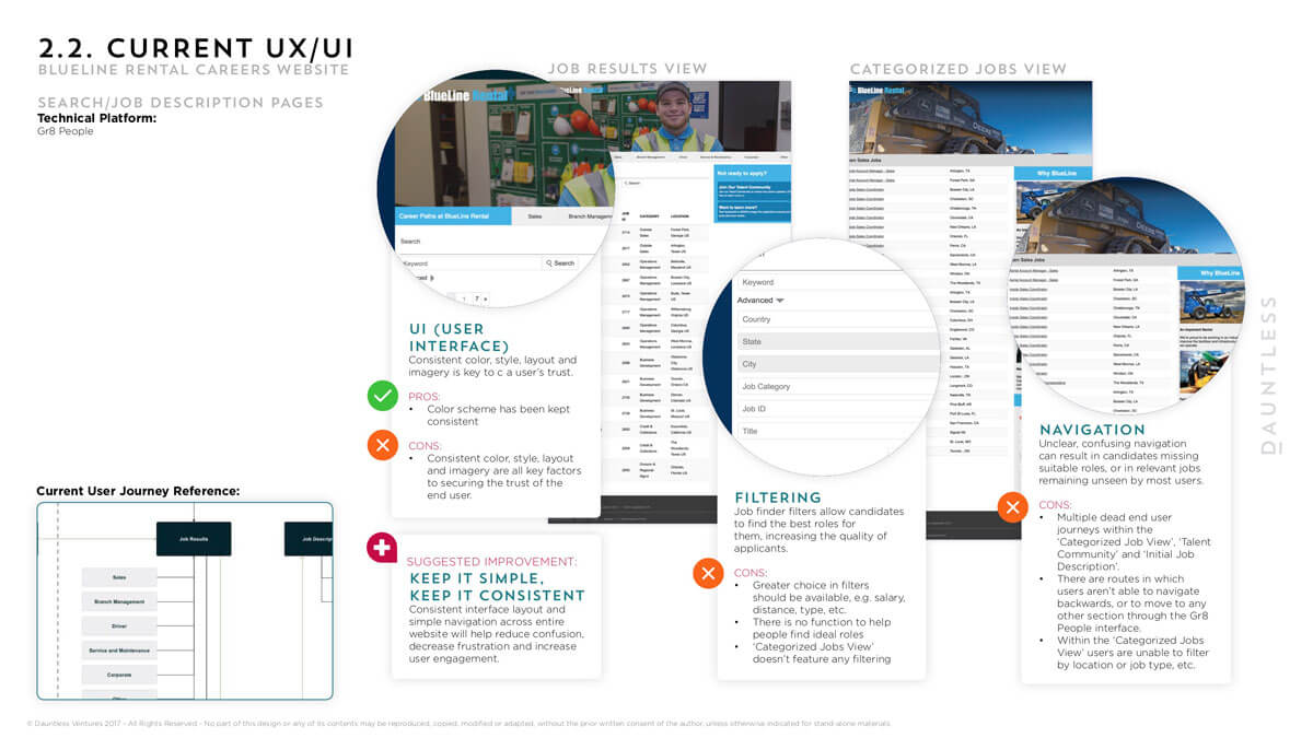
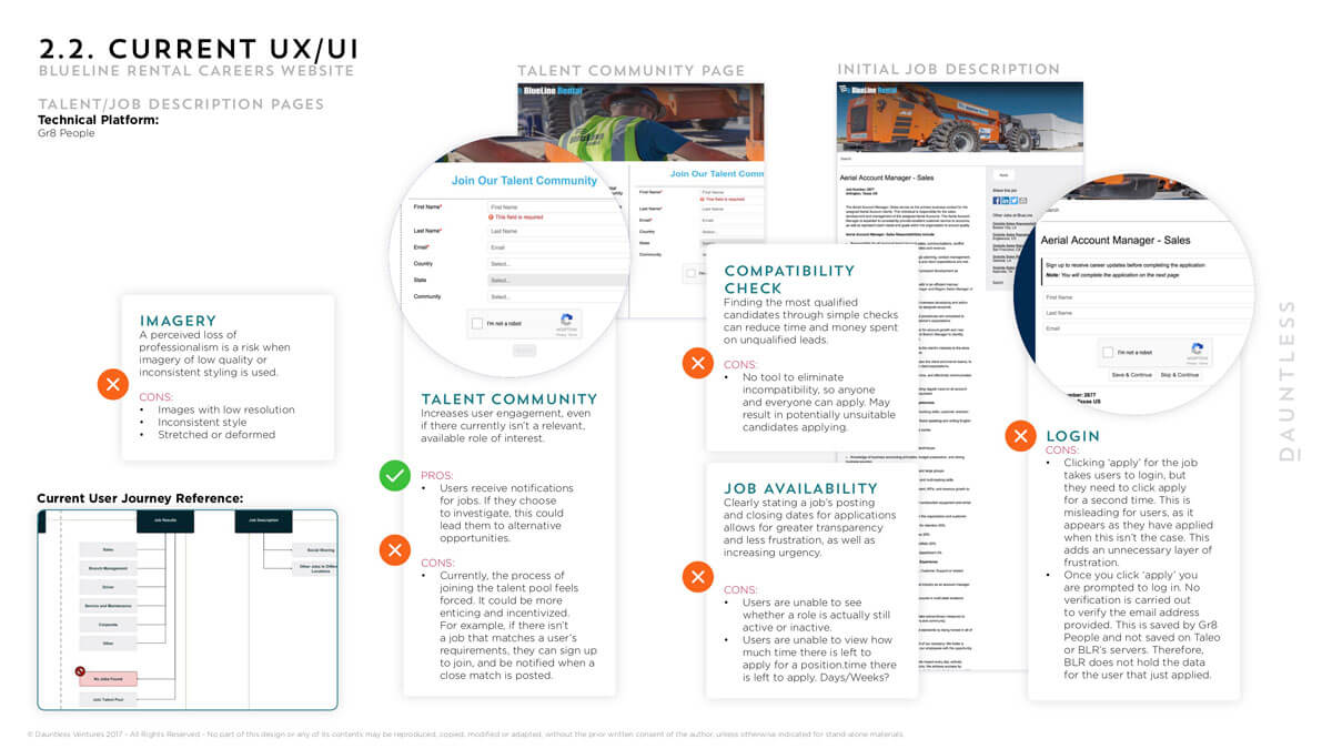
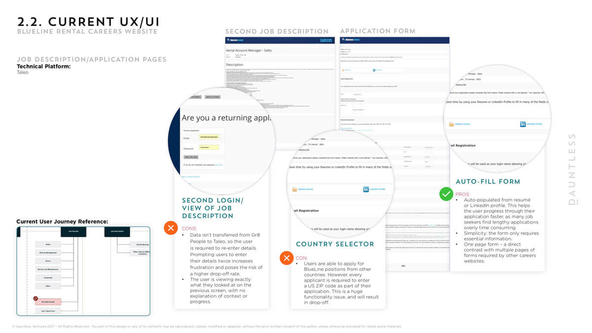
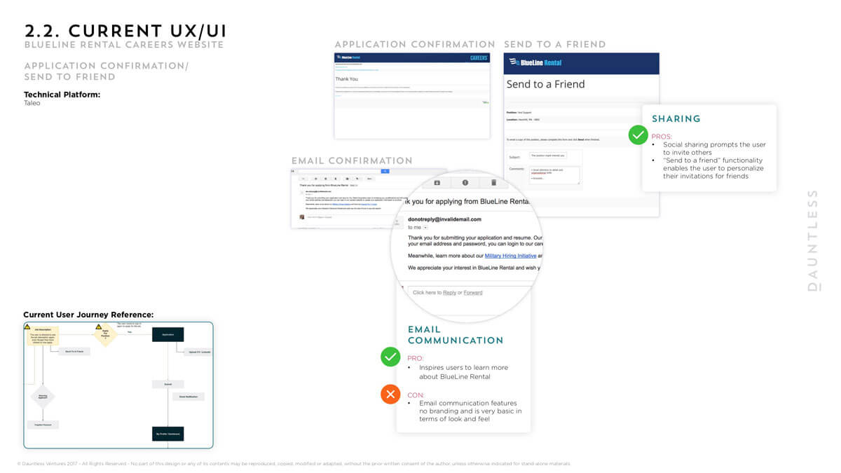
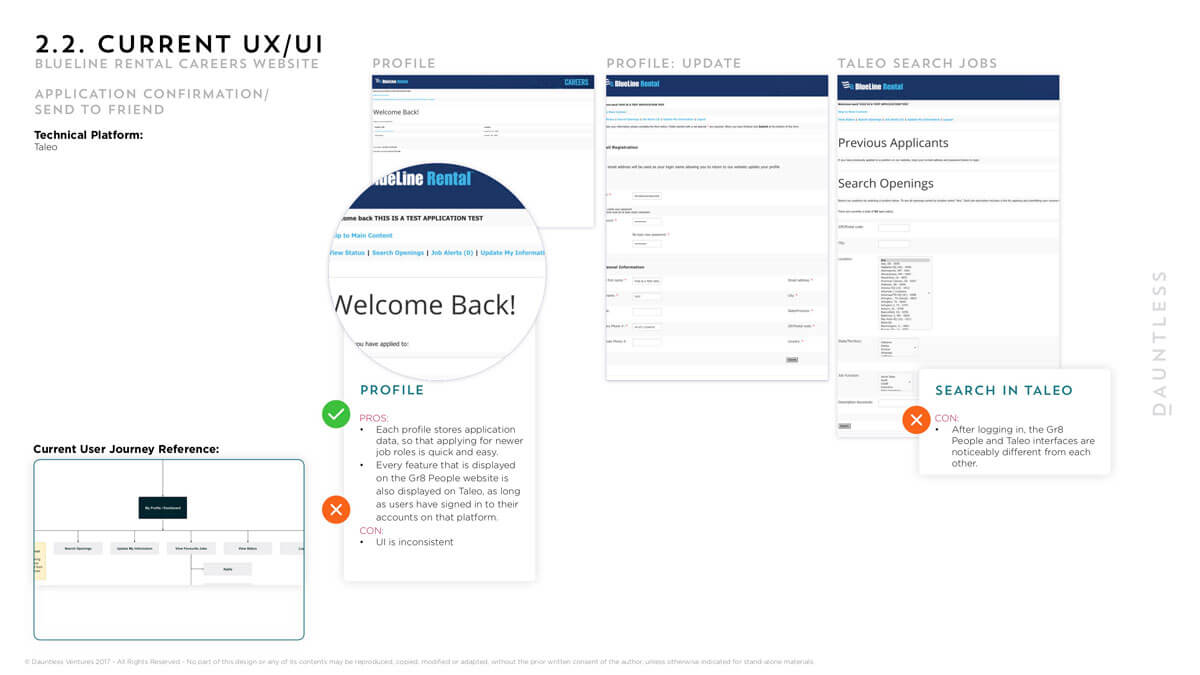
There were three interfaces with which users needed to interact with in order to apply for a job with BLR. After navigating and exploring the site thoroughly I uncovered a wide range of UX and UI issues with the application process.
A few issues such as:
- There were restrictions between logins in between the different systems so applicants that applied for a role were never able to recover the applications & often having to login between portals with much uncertainty
- There was no email validation checks between gr8 people system to Taleo resulting in open for spam
- UX issues such as seeing the job description twice even though they’ve clicked through to ‘apply’
- Sometimes even being boucnced to and from the two systems – it was completley unfuctional
- UX was univiting to anyone wanting to apply for a job
Uncovering UX & UI issues
To really heighten the need to change the system I did a thorough investigation of the careers section of the site unearthing all the areas for improvement.
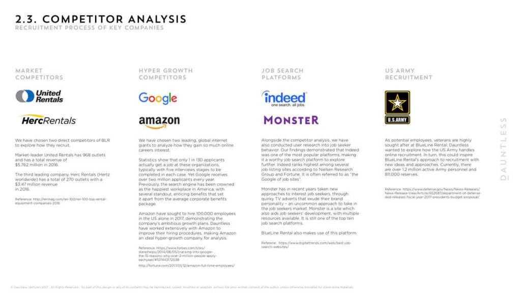
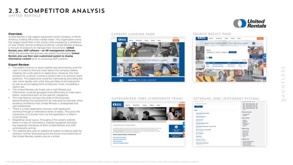
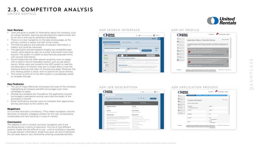
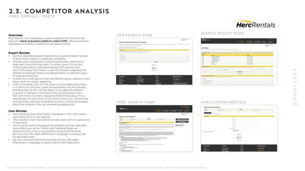
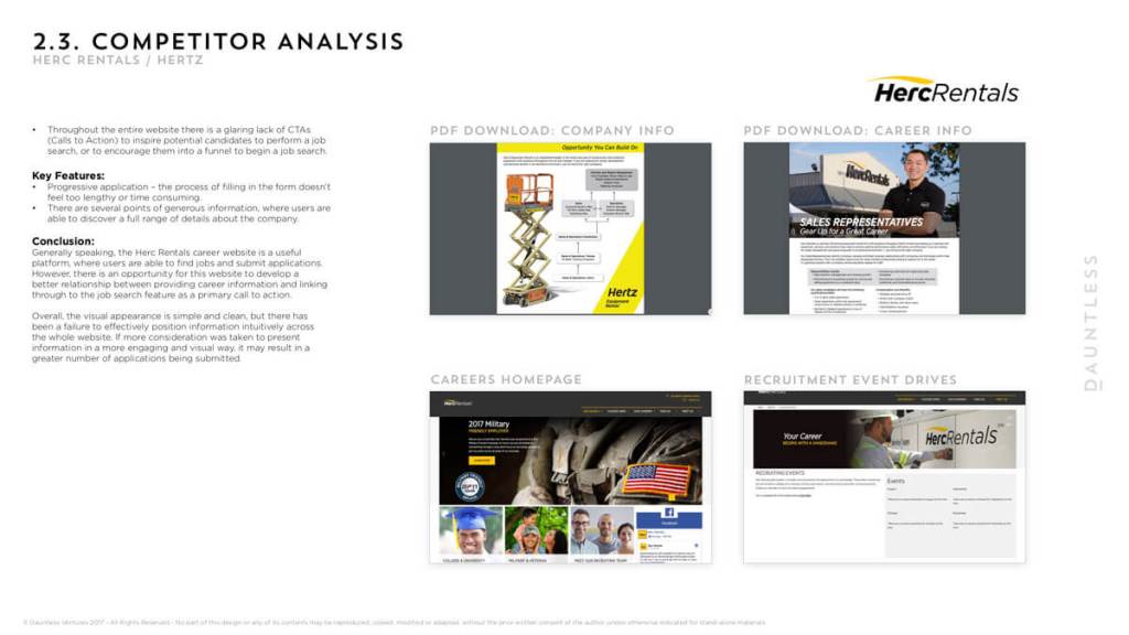
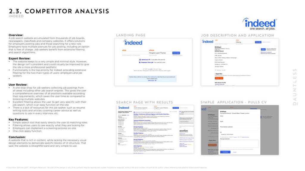
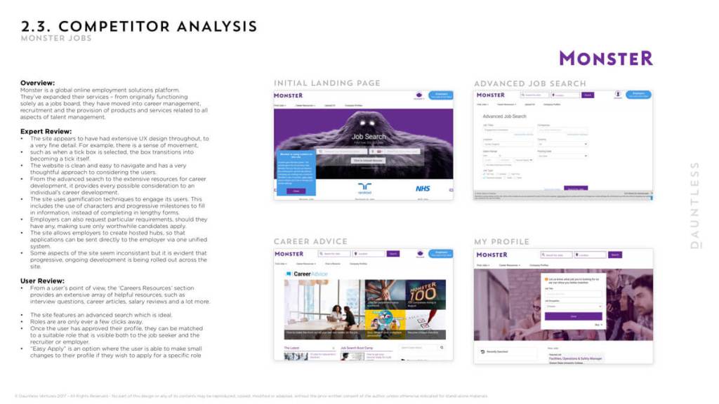
Competitor investigations
Uncovering all areas of competitors helped to highlight areas of importance and denounce areas of irrelevance to help strengthen the user journey proposal.

User journey
Working up a user journey in agreement with all of the stakeholders.
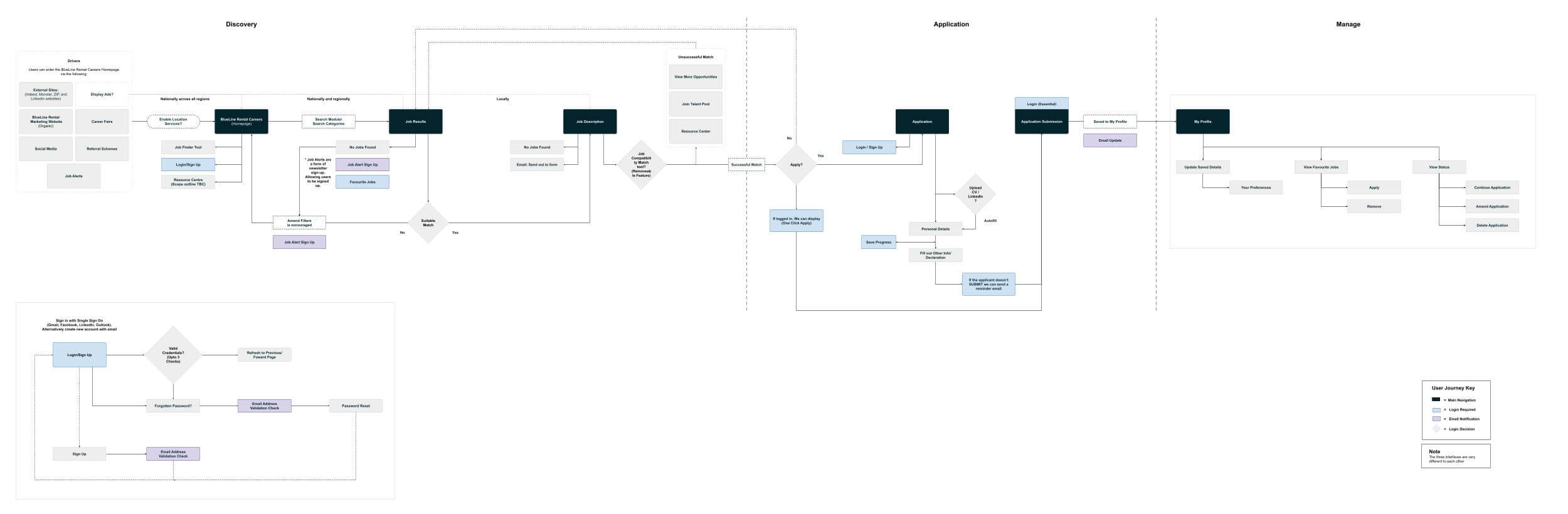
The idea was to never come across as discouraging or never to deter anyone from finding their ideal in their pursuit to working at BLR, tools such as Job finder and Qualification finder were always there to help guide users in uncovering what suits them or what may be needed to achieve the goal of a particular role.
For example in order to become a BLR driver, you need to qualify for a CDL Drivers licence, gain safety qualifications and perform well on a medical card, a user may need help in knowing help finding where and how to go about being qualified.
Wireframes
I created the wireframes and prototyped this across invision in order to test the designs prior to going through to design and development.
Here are some of the core screen selections of the desktop and mobile wireframes created for the site.


Adherining to guidelines
As the brand identity and styling were set prior, I followed the styling through into the designs of the site.
UI Designs
A few of the UI design is presented below accompanied by some feature highlights.
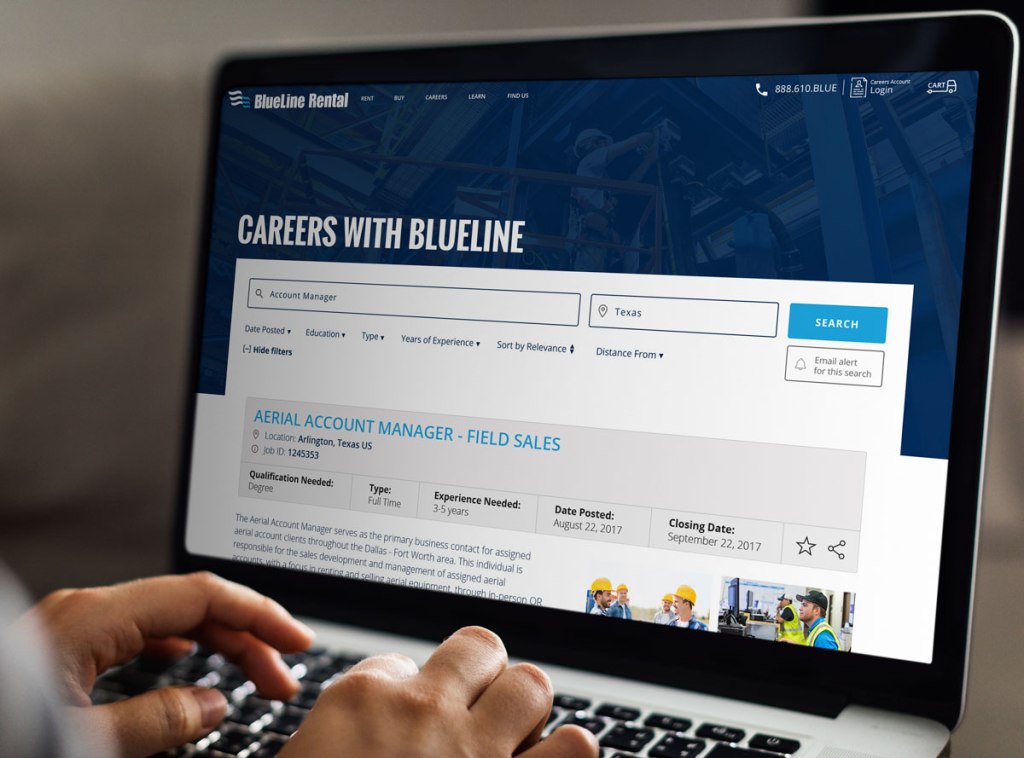
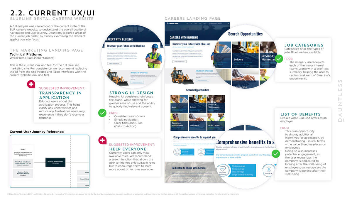
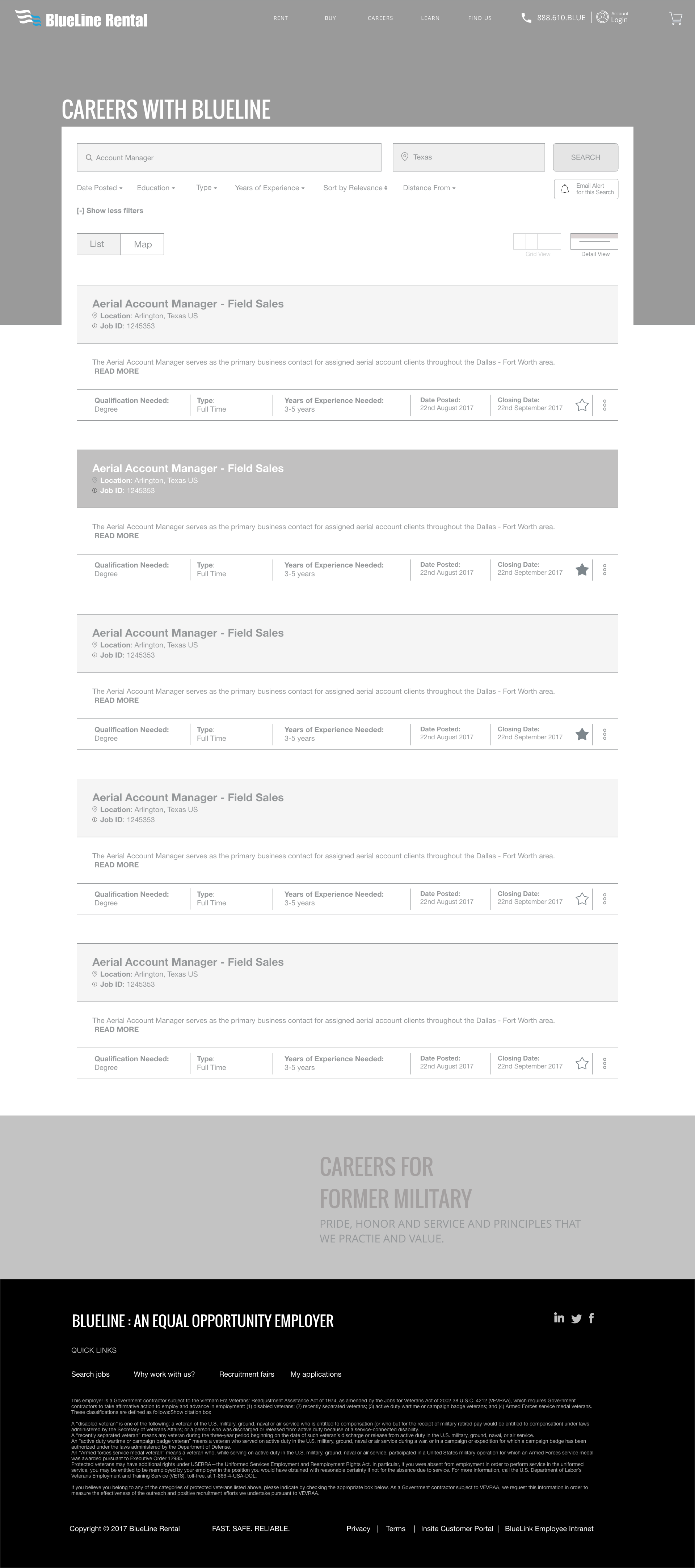
Job Results page
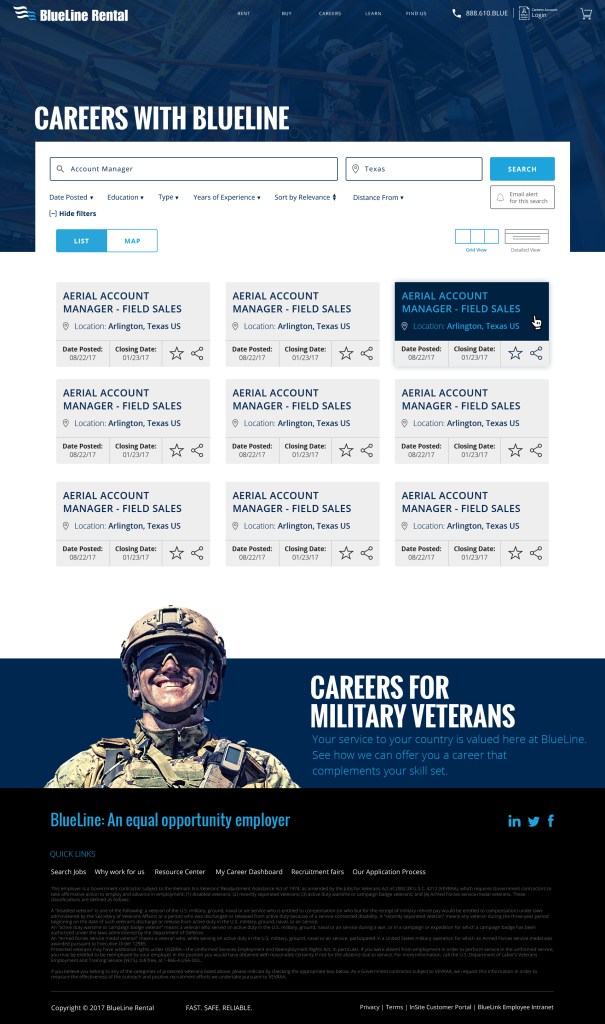
Results page features:
A wide range of filtering was available to help uncover exactly what was relevant to the user from distancing, education level, experience level and more. List and map view was added as a lot of jobs were highly impacted by the geography of particular branches. These features provided users control over the jobs and how they wanted to see them.
A lot of the pages throughout the site featured a “Military driver banner” This is a result of a lot of veterans working for BLR so a continued drive to bring on this audience was made.
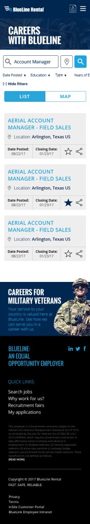
Job Description page
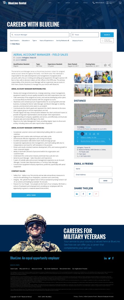

Job Description pages:
Were now a lot more inviting and engaging to users. Instead of solely being long description pages. The pages now had a range of features and functionality in order to benefit the user.
- A key information section: highlighting the key information related to the job
- Detailed description: highlighting the full details of the job
- Images: Related images to the job to really help set the scene on where individual would be working and what sort of environment they would be in. Which really isn’t present across most job sites.
- Distance tool: This helped to show the user how long their journey would be from their chosen branch. This tool was pre-built into other areas of the site so it gave us great strength in adding this feature into the job description -which was a great UX win.
- Sharing and Emailing tools: This was now more readily available then before
- Sticky buttons to help drive the ‘Apply now’
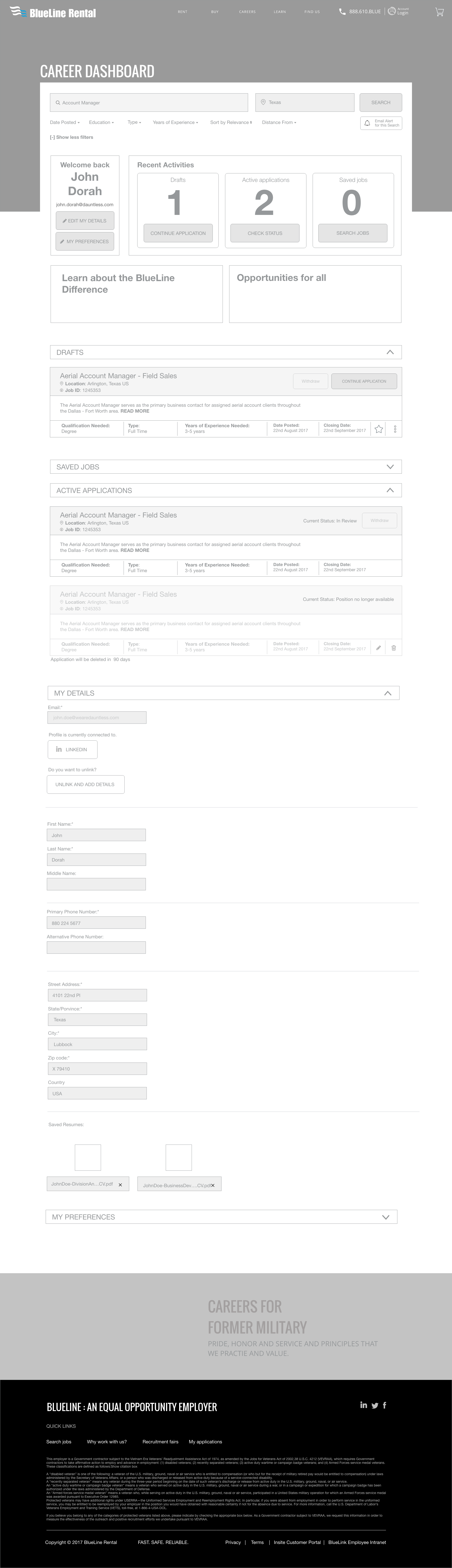
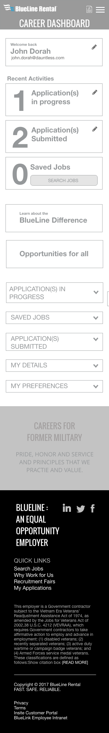
Your Application
This is just one of the screens highlighting how the application pages would work.
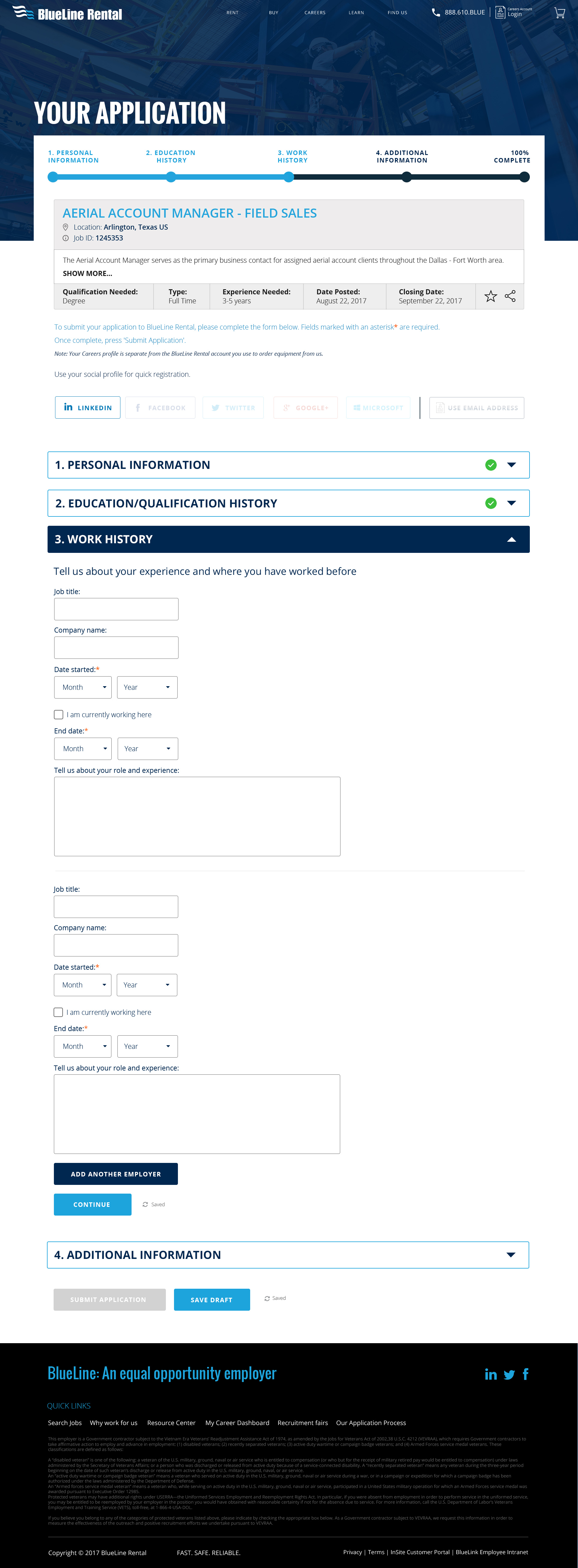

Job Application:
Job Applications are often very lengthy and time-consuming to pull relevant content in. There was a range of features added to help users through the application.
- A progress bar- using a gamified mechanic to help the user progress through the application and let them know exactly at which stage of the application they are in which is often not seen in a lot of job application sites. This feature was also made sticky at the job on mobile to help the user identify exactly where they are on a smaller screen
- A reminder job header. Users often like to make reference to the job description while filling the form so highlighting the key information in the job header helped those users
- Social media integration: A feature was added to help pull in certain information from social media pages to lessen the amount they would need to input into the form fields. Within the research phase I uncovered this was critical at times as job seekers are often applying for several jobs at a time so helping to quicken the process make the UX more plesant
- Contents within accordion: Instead of an intimidating long form to fill in, contents was broken down into sections so sections were completed and saved by the server to help applicants with time constraints come back to applications, also help it appear less intimidating, saving milestones on the server also helped BLR re-push to those applicants as a reminder
- Save draft: Helped users to save along the way without the fear of losing their application to connection issues or other distractions
If you would like to see more detailed screen designs or find out more, please feel free to get in touch at madebyfarha@gmail.com.
Results
An easy to use synced system for job applicants
- BlueLine Rental was acquired by the biggest competitor just one year later
- Increased their net worth by $145 million through improved process efficiencies
- The result was a modern, comprehensive, and easy-to-use job finder tool that simple for job applicants.
- Simplified and streamlined experience
